Layout control
Parameter types described in this section are not intended to pass any values to your script. They all are intended to organize the palette and improve the user experience of the PythonPart.
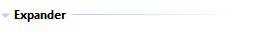
Expander
Use the expander to group controls within an expander to allow the user to collapse or expand the enclosed controls.
<Parameter>
    <Name>Expander</Name>
    <Text>Expander</Text>
    <ValueType>Expander</ValueType>
    <Visible>True</Visible><!--(2)!-->

    <Parameter>
    <!--(1)!-->
    </Parameter>
</Parameter>
- All parameters placed here will appear under this expander.
If no parameters are assigned, the expander will not be displayed. This would
also be the case, if all the parameters are hidden (
<Visible>tag set to false) OptionalIt is possible to hide the expander with all its controls by changing the value of this tag. Read more about controlling the visibility state here.
Tip
You can set the expander to be collapsed by default, when the PythonPart is started,
by setting the <Value> tag to True
Example
The example implementation of the Expander value type can be found here:
- …\etc\Examples\PythonParts\PaletteExamples\Expander.pyp
- …\etc\PythonPartsExampleScripts\PaletteExamples\Expander.py
Separator
Use the separator to draw a horizontal line in the palette to separate the controls visually.

Row
Using row it is possible to show multiple controls in one line.
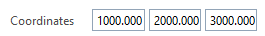
<Parameter>
    <Name>Row1</Name>
    <Text>Coordinates</Text>
    <ValueType>Row</ValueType>

    <Parameter>
    ...
    </Parameter>
</Parameter>
Entire row
It is possible to extend all the controls within the row to the entire palette width, like shown below with the row second cube. This will ignore the vertical palette division to left side with texts and right side with values.
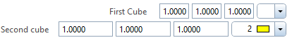
To achieve the effect as shown above, the parameter Row must be defined like this:
<Parameter>
    <Name>Row2</Name>
    <Text></Text><!--(2)!-->
    <Value>1<!--(1)!--></Value>
    <ValueType>Row</ValueType>

    <Parameter>
        <Name>Text</Name>
        <Text></Text>
        <Value>Second cube</Value><!--(3)!-->
        <ValueType>Text</ValueType>
    </Parameter>

    <Parameter>
        <Name>Length2</Name>
        <Text>Length</Text>
        <Value>1000.</Value>
        <ValueType>Length</ValueType>
    </Parameter>
    ...
</Parameter>
- We add an additional tag
<Value>and assign 1 to it. - In this case, the
<Text>tag of the row is not used. - To display a text Second cube on the left, an extra parameter of type Text must be added at the row beginning.
Example
The example implementation of the Row value type can be found here:
- …\etc\Examples\PythonParts\PaletteExamples\Row.pyp
- …\etc\PythonPartsExampleScripts\PaletteExamples\Row.py
Picture
With the parameter type Picture it is possible to display a picture in the property palette.
<Parameter>
    <Name>Picture</Name>
    <Value>PictureForPalette.png</Value><!--(1)!-->
    <Orientation>Right</Orientation><!--(2)!-->
    <ValueType>Picture</ValueType>
</Parameter>
- The path provided here must be relative to the path of the .pyp file
- The horizontal position of the picture can be defined here. Possible
values are
Left,MiddleandRight
Text
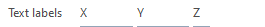
The value type Text is used to display a Text in the control section (right side) of the property palette. This type of parameter in combination with the parameter Row can be used to create the header of a table like this:
<Parameter>
    <Name>FirstText</Name>
    <Text></Text>
    <Value>X</Value>
    <ValueType>Text</ValueType>
</Parameter>
Example
The example implementation of the text value type can be found here:
- …\etc\Examples\PythonParts\PaletteExamples\Text.pyp
- …\etc\PythonPartsExampleScripts\PaletteExamples\Text.py