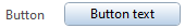
Button
If some actions need to be triggered manually by the user of the PythonPart, a good idea to make it possible is to place a button in the palette. Because there are two texts needed (one for the button and one for the text on the left side of it) the button must be placed in a row. Here is a short example of how it should be done:
<Parameter>
    <Name>ButtonRow</Name>
    <Text>Button</Text> <!--(1)!-->
    <ValueType>Row</ValueType>

    <Parameter>
        <Name>Button</Name>
        <Text>ButtonText</Text> <!--(2)!-->
        <EventId>1000</EventId> <!--(3)!-->
        <ValueType>Button</ValueType>
    </Parameter>
</Parameter>
- This text will appear on the left side of a button...
- ...this, however, on the button itself. If it is too long, only the end will be displayed directly on the button. The complete text will be displayed as a tooltip.
- This value is passed to the script to determine, which button was clicked. If there are several buttons in the palette that should do the same job, you can assign the same EventId to them.
In order to control, which action should be triggered in the script, use the tag <EventId>.
When a button is clicked, the function on_control_event
is called and the the value of <EventId> tag is being given as (one of the) arguments. Here is how the
implementation in a script can look like:
Example
The implementation of the Button value type is described in the example Button, which is located in:
- …\etc\Examples\PythonParts\PaletteExamples\Button.pyp
- …\etc\PythonPartsExampleScripts\PaletteExamples\Button.py
- …\etc\Examples\PythonParts\PaletteExamples\ButtonList.pyp
- …\etc\PythonPartsExampleScripts\PaletteExamples\ButtonList.py
Special button types
Button with hyperlink
To open a web page directly when a button is clicked, provide the address within
the <Value> tag to the parameter as follows:
<Parameter>
    <Name>Button</Name>
    <Text>ButtonText</Text>
    <EventId>1000</EventId>
    <ValueType>Button</ValueType>
    <Value>https://www.allplan.com</Value>
</Parameter>
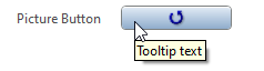
Button with picture
To place a button with a picture defined in a .png file, use the <ValueType> PictureButton
<Parameter>
    <Name>PictureButton</Name>
    <Text>Tooltip text</Text><!--(1)!-->
    <EventId>1000</EventId>
    <Value>ButtonImageReset16.png</Value><!--(2)!-->
    <ValueType>PictureButton</ValueType>
</Parameter>
- This text will only appear as tooltip
- Provide the path to the image file relative to the .pyp file
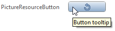
To use Allplan's internal image resources, use the <ValueType> PictureResourceButton
<Parameter>
    <Name>PictureResourceButton</Name>
    <Text>Button tooltip</Text><!--(1)!-->
    <EventId>1000</EventId>
    <Value>17027</Value>
    <ValueType>PictureResourceButton</ValueType>
</Parameter>
- This text will only appear as tooltip
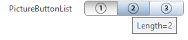
Multiple buttons
To place several buttons in a row, each with a picture defined in a .png file, use
the <ValueType> PictureButtonList.
<Parameter>
    <Name>PictureButtonList1</Name>
    <Text>Length=1|Length=2|Length=3</Text>
    <Value>0</Value> <!--(1)!-->
    <ValueList>0|1|2|3</ValueList> <!--(2)!-->
    <ValueList2>param01.png|param02.png|param03.png</ValueList2> <!--(3)!-->
    <ValueType>PictureButtonList</ValueType>
</Parameter>
- The value defined here will be selected by default
- Here we define integer values corresponding for the images. The values must be separated by
| - The path for the images should be defined relative to .pyp file and separated with
|
To place several buttons in a row, each with a picture from Allplan's internal
image resources, use the <ValueType> PictureResourceButtonList
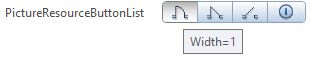
<Parameter>
    <Name>PictureResourceButtonListValue</Name>
    <Text>Width=1|Width=2|Width=3|Width=4</Text>
    <Value>0</Value> <!--(1)!-->
    <ValueList>0|1|2|3</ValueList> <!--(2)!-->
    <ValueList2>16433|16441|16449|14563</ValueList2>
    <ValueType>PictureResourceButtonList</ValueType>
</Parameter>
- The value defined here will be selected by default
- Here we define integer values corresponding for the images. The values must be separated by
|
Tip
This kind of buttons are not intended to be an event trigger as they
do not have the value of <EventId> assigned to them. You can however use them as triggers,
but the implementation must be done within the function modify_element_property, which
is called after every property modification within the property palette:
Button for a reference point
The value type RefPointButton is used to create a button for a selection of a reference point ID. This kind of button gives an integer value that corresponds with the selected point.
The following IDs are assigned to the existing reference points:
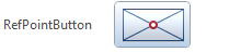
<Parameter>
    <Name>RefPointId</Name>
    <Value>5</Value><!--(1)!-->
    <ValueType>RefPointButton</ValueType>
</Parameter>
-
The integer values corresponding with alignments are:
Value Position 1 top left 2 top middle 3 top right 4 middle left 5 center 6 middle right 7 bottom left 8 bottom middle 9 bottom right
Material selection
The value type MaterialButton is used to create a button for the selection of a material surface (.surf file) that can the assigned to a PythonPart for visualization purposes. After clicking the button, the dialog for custom surface selection will be opened.
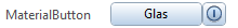
<Parameter>
    <Name>MaterialButton</Name>
    <Text>MaterialButton</Text>
    <Value>Glass</Value><!--(1)!-->
    <ValueType>MaterialButton</ValueType>
    <DisableButtonIsShown>True</DisableButtonIsShown><!--(2)!-->
</Parameter>
- The
<Value>stands for the name of the .surf file OptionalBy setting this tag to false you can disable the small button on the right, which is used to reset the input value.
Additional tags
Text size
The size of the text appearing on the button can be controlled by an optional tag <FontStyle>
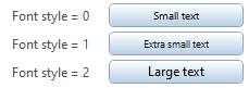
<Parameter>
    <Name>Row1</Name>
    <Text>Font style = 0</Text>
    <ValueType>Row</ValueType>

    <Parameter>
        <Name>Button1</Name>
        <Text>Small text</Text>
        <EventId>1000</EventId>
        <ValueType>Button</ValueType>
        <FontStyle>0</FontStyle><!--(1)!-->
    </Parameter>
</Parameter>
-
Possible options for the tag are:
Value Style 0 small 1 extra small 2 large